Pagefully draws every screenshot of a page in three sizes, and Apple fits the other sizes on its list from those. A page you send arrives in App Store Connect with the sets below, and nothing else needs uploading.
| Set | Pixels | Shown on | Sent as |
|---|---|---|---|
| iPhone 6.9" | 1320 x 2868 | iPhone 17 Pro Max, 16 Pro Max, 16 Plus, iPhone Air | The 6.9" iPhone set |
| iPhone 6.5" | 1284 x 2778 | iPhone 14 Plus, 13 Pro Max, 12 Pro Max, 11 Pro Max | The 6.5" iPhone set |
| iPad 13" | 2064 x 2752 | iPad Pro 13", iPad Air 13" | The 13" iPad set, for an app that runs on iPad |
Both iPhone sets come from the same screenshot: its words are set once and fitted to each size. The iPad set is drawn from the iPad screenshot at the same position on your listing.
| Size | Pixels | Shown on | Apple fits it from |
|---|---|---|---|
| iPhone 6.3" | 1206 x 2622 | iPhone 17 Pro, 17, 16 Pro, 16, 15 Pro, 15 | The 6.5" set |
| iPhone 6.1" | 1170 x 2532 | iPhone 17e, 16e, 14, 13, 12 | The 6.5" set |
| iPhone 5.5" | 1242 x 2208 | iPhone 8 Plus, 7 Plus, 6s Plus | The 6.1" size |
| iPhone 4.7" | 750 x 1334 | iPhone SE, 8, 7, 6s | The 5.5" size |
| iPad 12.9" | 2048 x 2732 | iPad Pro 12.9" (2nd generation) | The 13" set |
| iPad 11" | 1668 x 2420 | iPad Pro 11", iPad Air 11", iPad, iPad mini | The 13" set |
The 6.9", 6.5", 6.3" and 6.1" sizes are one shape, so one picture fits them all with almost nothing trimmed. The 5.5" and 4.7" sizes are a wider shape; Apple scales them from the 6.1" size, so older iPhones show the same picture with a little more trimmed from its edges.
Landscape
Apple takes every size turned on its side as well. A screenshot that is landscape on your listing stays landscape on the page, drawn at the same size turned on its side: an iPad screenshot at 2752 x 2064, for example. Each screenshot keeps its own orientation.
The device tabs in the page editor
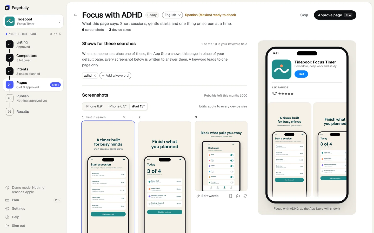
Under Screenshots, the tabs iPhone 6.9", iPhone 6.5" and iPad 13" show the page as it is drawn for that set. The line Edits apply to every device size means what it says: a headline you change, a screen you swap or a screenshot you remove changes on every set at once, and each set is drawn again. The header counts {n} device sizes. The check Drawn for every device size blocks approval until each set is complete.
The iPad 13" tab is live only for an app whose listing has iPad screenshots, that is, an app that runs on iPad. For any other app the tab is disabled with Your listing has no screenshots for this device, and the page is sent with its iPhone sets only.
Apple’s required sizes
Apple’s list of required sizes changed recently: it now names one screenshot for iPhone with Dynamic Island (medium display), the 6.3" size, and still marks the 6.5" size as required when no 6.9" set is given. A page from Pagefully carries both iPhone sets, and Apple fits the 6.3" size from them, so a page meets the rule as it stands. For an app that runs on iPad, the 13" set is required and is sent.
For Apple’s full list, with every accepted pixel size, see Custom product page requirements. To check a file of your own against the list, use the screenshot size checker.